Composition isn't magic. It's a set of practical techniques that guide where viewers look on your screen. The thing is, most photographers learn rules like the rule of thirds, then spend years trying to follow them religidly. That's not how it works. You've got to understand the why behind each rule first, then you'll know when breaking them actually makes your shot stronger.
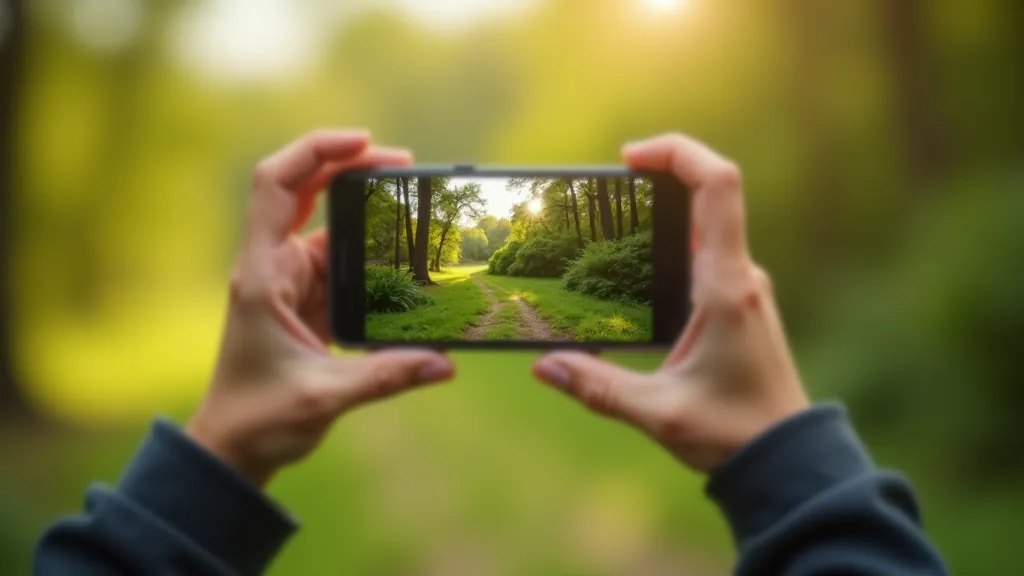
On mobile phones especially, composition matters even more than on larger cameras. Your screen is small. Everything's compressed. A poorly framed shot looks cramped. A well-composed one feels intentional and clean. We're talking about the difference between someone scrolling past your photo and actually stopping to look.
The Rule of Thirds: Actually Worth Learning
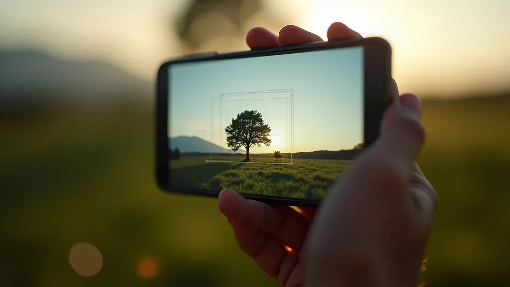
You've probably heard this one. Divide your frame into a 3x3 grid using two horizontal and two vertical lines. Place important elements along these lines or at the intersections. It's not revolutionary, but it works because of how human eyes naturally scan images.
Here's what makes it valuable on mobile: your phone's camera app has a grid option. Turn it on. Seriously. Most phones have this built in — go to Settings > Camera > Grid. Now when you're composing shots, you'll see those lines overlaid on your screen. You don't have to memorize anything. Just place your subject along one of the grid lines instead of dead center.
Where it fails: dead-center compositions sometimes look stronger. A portrait straight-on. A sunset split exactly in the middle. Don't force the rule. If centering looks better, center it.

Leading Lines: Guiding Your Viewer's Eye
Leading lines are paths in your image that naturally draw attention toward your main subject. Roads disappearing into the distance. Rows of trees. A fence line. Anything that creates a visual path. On a small phone screen, these lines become even more powerful because you're controlling exactly where the eye travels on that limited space.
Look for lines everywhere: architectural elements, shadows, water reflections, even people's body positions. When you frame your shot, position these lines so they lead toward something interesting. Not toward the edge of the frame — toward your actual subject.
Mobile advantage: because your phone's sensor is smaller and your field of view is tighter, leading lines become more pronounced. That winding road doesn't just disappear — it dominates the frame. Use that.
Quick Composition Checklist
- Enable grid mode in your phone's camera app
- Identify one clear subject or focal point
- Position that subject along a grid line, not dead center
- Look for leading lines that point toward it
- Check what's in the background — simplify if it's cluttered
- Step back and ask: what's this photo actually about?
Framing and Negative Space: Less Is Often More
Negative space is the empty area around your subject. It's not wasted space — it's breathing room. On mobile phones, negative space becomes critical because you don't have much real estate. Too many elements competing and your photo feels chaotic. One clear subject with lots of breathing room around it? That feels intentional.
Think of it like this: if your subject is 30% of the frame, that other 70% is negative space. Use it strategically. A person against a clear sky. A flower with out-of-focus green background. A boat in open water. The emptiness actually strengthens the composition because nothing distracts from your main point.
On small screens, this matters even more. You're not printing a billboard. You're creating an image maybe 3-4 inches tall when someone's looking at it on their phone. Simplicity wins. One thing. Done well. Everything else supports it.


Depth and Layering: Creating Dimension on a Flat Screen
Your phone screen is flat. But you can create the illusion of depth by layering elements at different distances from the camera. Foreground (something close), middle ground (your subject), background (what's behind). This layering makes a photo feel dimensional instead of flat.
Example: photographing a person with a blurred street behind them and maybe a fence in the foreground. That's three layers. The eye reads it as deep, even though you're looking at a 2D screen. On mobile, where everything's compressed, this technique becomes especially valuable for making images feel less cramped.
You don't need fancy equipment. Just position yourself and your subject so there's clear separation between foreground, subject, and background. Phone cameras do most of the work — they'll naturally blur the background if you focus on your subject.
When to Break the Rules (Yes, Really)
Here's the thing nobody tells you: the best photographers know the rules so well they know exactly when breaking them creates stronger work. A portrait shot slightly off-center works. A subject filling the entire frame with zero negative space works if that's intentional. Chaos and clutter can work if you're deliberately capturing energy.
The key word is intentional. You're not breaking rules because you don't know them. You're breaking them because you understand why they exist and you've got a reason to do something different. That's the whole difference between lucky and skilled.
Start with the fundamentals — grid, leading lines, negative space, depth. Use them for the next 20 photos you take. Get comfortable. Then start experimenting with what happens when you don't follow them. You'll develop instincts. Your eye will get faster. After a few months, you won't need to think about composition anymore. It'll be automatic.
Educational Note
This guide presents composition principles and techniques used in photography education. Results vary based on individual practice, device capabilities, lighting conditions, and subject matter. These are guidelines, not absolute rules. Photography is ultimately about creative expression — use these principles as tools, not constraints.